
What our other tests were never looking at
Unit tests prove the logic is right. End-to-end and integration tests prove a flow completes. Neither of them notices that a row grew two points taller, that a separator changed shade, or that the label on a button appearing across five screens changed size. That is not a failing of either. They are not looking at the rendering: they ask whether the app did the right thing, and they answer that well.
Checking the rendering by hand is possible, and it is not even hard. An inspector will give you a font size to the point: open the screen, find the element, read the value. You just have to do it for every element, on every screen. And by the fifth pass over the same screen, change blindness takes exactly the details you came for.
So we added an instrument that answers two different questions. The first: does this value in the code come from the design system. The second: has the rendering changed since last time. Neither replaces the other, and neither tells you whether a screen looks good.
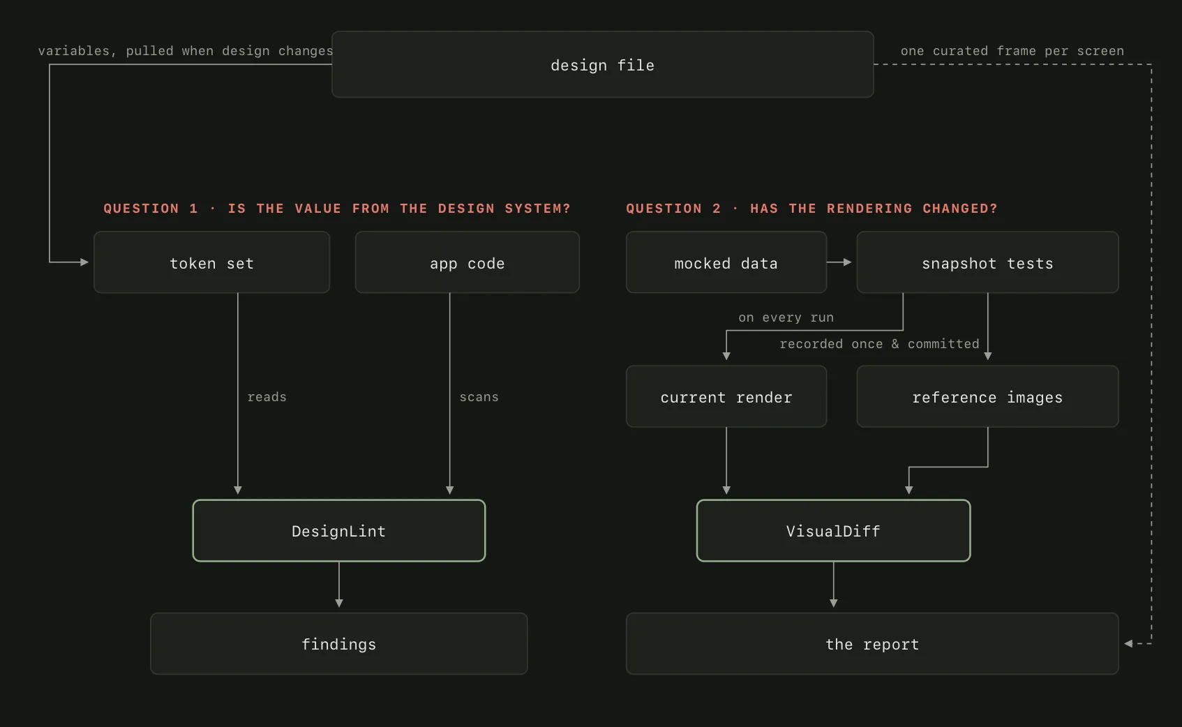
The two questions, and the two halves that answer them. Everything on the left asks whether a value belongs to the system; everything on the right asks whether the rendering moved.
The flow, end to end
It starts in the design file, and that is the condition everything else rests on. Color and type have to be variables rather than values pasted onto a layer. Only then does a value have a name that can be read mechanically. Screens have to be numbered frames; we have fifty-eight of them across thirty-six names, so every screen has an address you can ask about. Our designers built the file that way before anyone thought about linting anything.
Figma exposes every frame over an API. For each element you can read its typeface, size, weight, letter spacing, color and position: the same properties the code sets, in the same units. The fix was to stop treating the design as pictures and start treating it as data.
And because every screen has an address, we can check whether it matches the design. Pull that frame’s nodes and compare element by element against what the code sets. A screen takes a few minutes and the output is a table rather than an impression: this element, this is what it renders, this is what the design says.
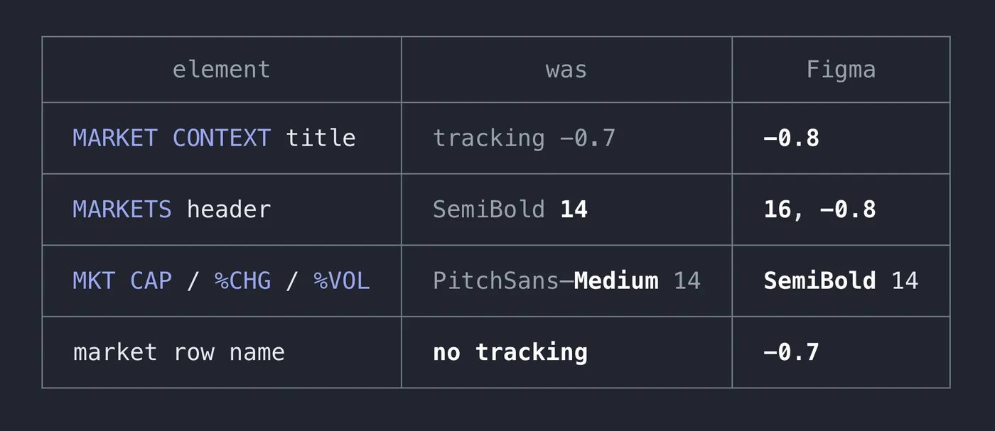
One screen read out of the design file and compared element by element against what the code sets. Four deviations, none of them catchable by eye.
The variables come down into the repository as a token set: twenty-three colors and eighteen type styles. The result is committed, so the history of that one file becomes the design-system changelog nobody otherwise writes, and the reference lives in the repo: nothing has to reach the design tool during a build.
A static scan reads the app against that token set. Interface files, source, color catalogs. It reports every color off the palette, every size off the scale, every spacing off the grid and every letter spacing that disagrees with its token, each with a file and a line.
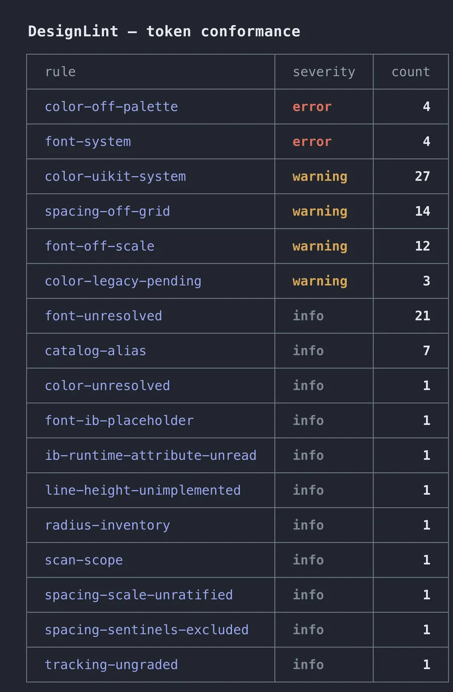
The scan's output: one row per rule, with severity and count. It needs no simulator and finishes in seconds.
Next to it sits a visual layer. Screens and components are built in a test off mocked data, rendered to an image, and compared against an image committed in the repository. Today that is a hundred such images (forty-one of screens and fifty-nine of components) covering nineteen screens and twenty-two components, because one screen usually owns several images: an empty state, an error state, a variant.
The comparison runs at three moments. Locally, in one command, before you open a pull request. On the pull request, where a single run first compares the images and then builds the report, comments it, and writes a summary into the description. And between releases: because the reference images are committed, “the previous version” is simply those files at a tag, so comparing two releases is not a build at all: nothing is rendered, no simulator starts, both sides already exist.
The two layers answer different questions, which is why neither substitutes for the other. The scan will tell you a color is not in the palette, but not that a screen looks different from last week. The rendering will tell you something moved, but not whether the value that moved exists in the system at all.
What makes the comparison mean anything
The data is mocked, so both sides get the same input. Every pull request therefore starts from the same structure, and two runs a week apart compare cleanly.
The rest of the repeatability is structural rather than a matter of discipline. Doubles in place of services, pinned image geometry, a pinned time zone and locale, guarded by a test of their own.
There are more component tests than screen tests, deliberately. Sensitivity is inversely proportional to the size of the thing you compare. The same fix (the one in the table above) moved under one percent of the whole-screen image; measured against the cells it actually lives in, one and a half to three. A change to a control that appears on five screens dissolves into each of them, so the things we care about are asserted as components rather than as the screen they sit on.
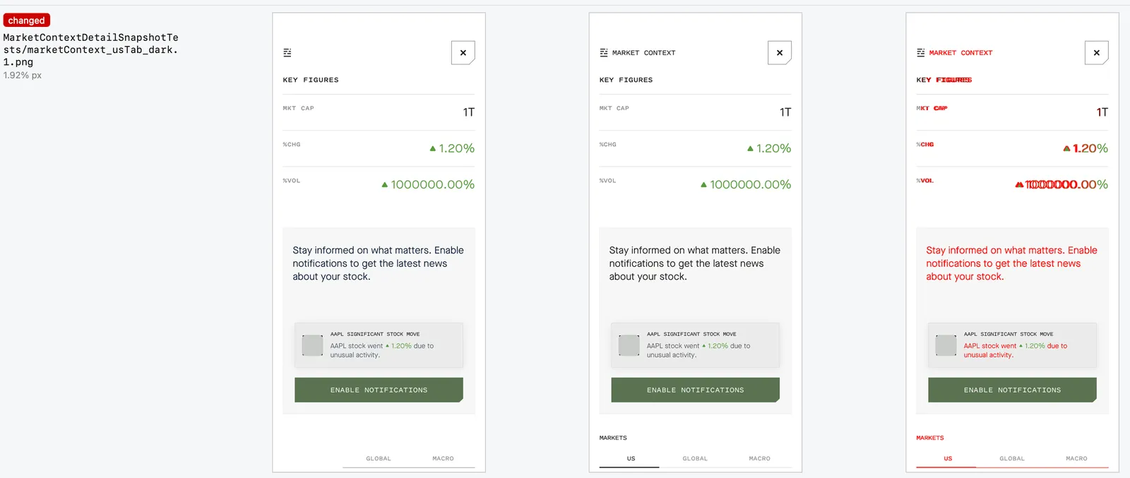
What the report looks like at screen level: reference, current render, and the pixels that differ, painted red.
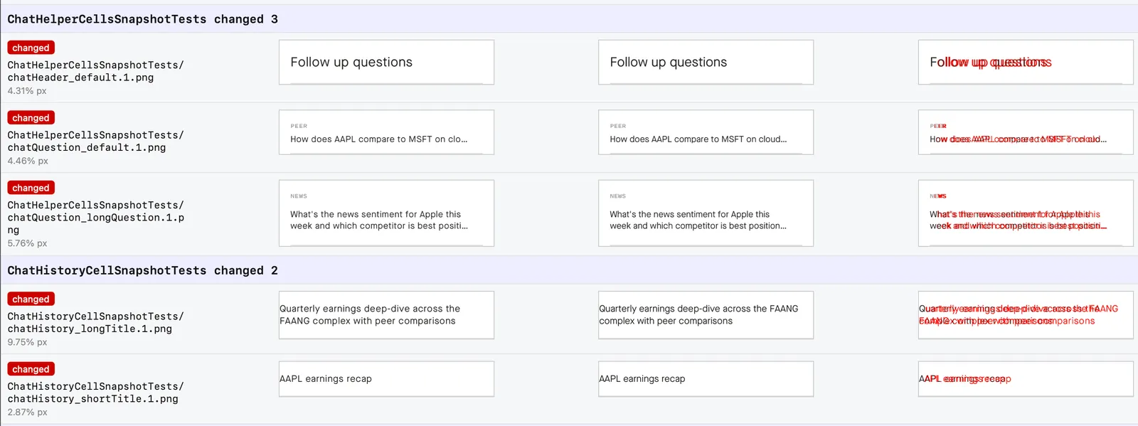
The same report at component level. The smaller the thing asserted, the larger the fraction a given change occupies.
What changed in the work
A change surfaces before review, not after. An engineer runs the comparison locally in one command and sees which images they moved before anyone starts reading the code. They fix it in the same sitting, instead of coming back to it two days later on someone else’s comment.
The review question became answerable. Every pull request carries a comment naming what changed, linking to before-and-after images the platform renders as a slider, and a block in the description naming the screens behind them. The question stopped being “did this touch the UI?” and became “this changed four screens; are those four intended?” Engineers and QA see the same evidence at the same moment, before anything is installed anywhere.
Accidental changes stopped being invisible. This is the payoff we went in for. A change to a shared component spreads to screens its author never opened and had no reason to open, and the report names them, including the changed screens that no test renders at all, because knowing where you have no evidence is worth more than another green check.
QA stopped hunting and started judging. Nobody sweeps screens looking for two points of difference any more; they get the list of what moved and decide whether the move was intended. The machine does not get bored on the fifth pass over the same screen.
A release gets one page instead of a conversation afterwards. A release is an accumulation of merges, each reviewed on its own. Comparing two tags takes seconds and tells you what to talk about before shipping.
Where it stops
The scan tells you whether a value comes from the system, not what it should be. The design says that, which is why both halves are needed.
The rendering tells you something changed, never that it is wrong. It covers nineteen of the app’s thirty-one screens, which is why the report names the ones it does not: knowing where the evidence is missing is part of the result rather than a hole in it.
Deciding whether a change was the one you meant to make is still a person’s job, and we do not expect that to move. What changed is when and on what that decision happens: on one page with both images side by side, before the release, rather than in a message from a client three weeks after it.